

R.A.D Global
Niche subcultures aren’t meant
for mass communication.
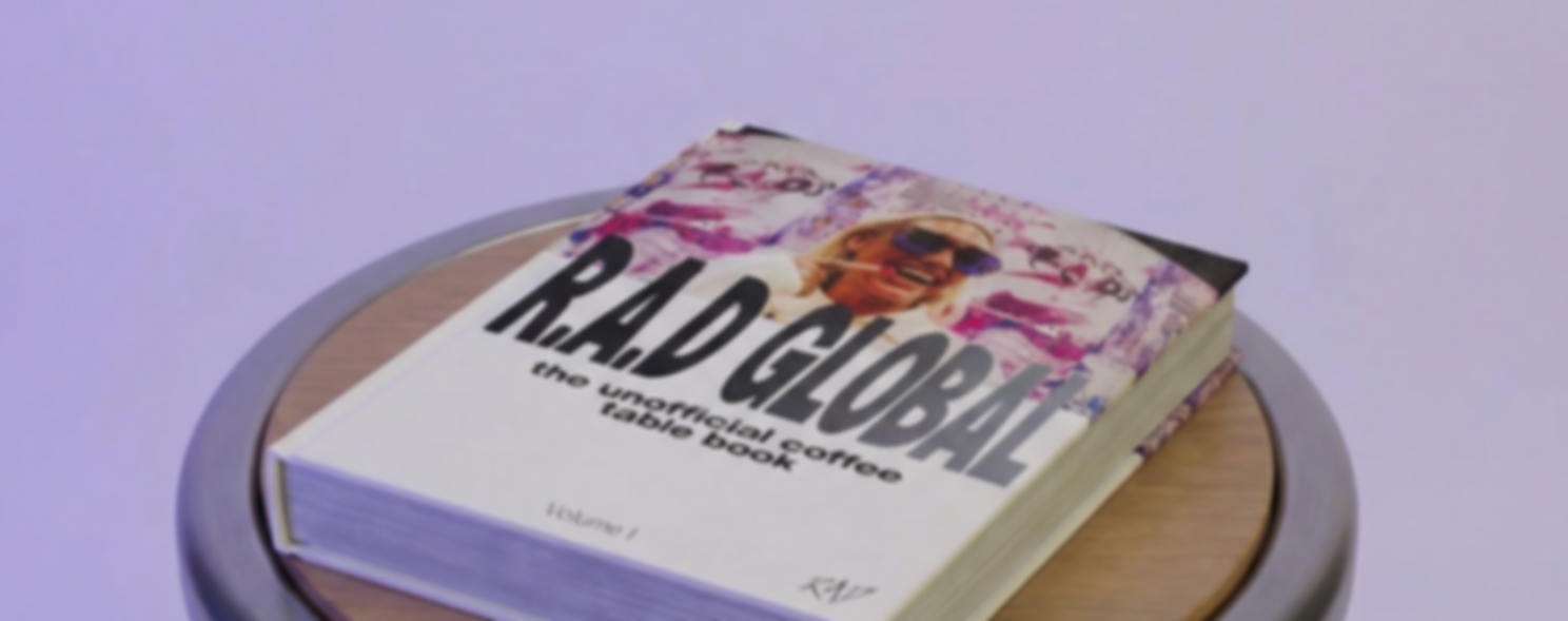
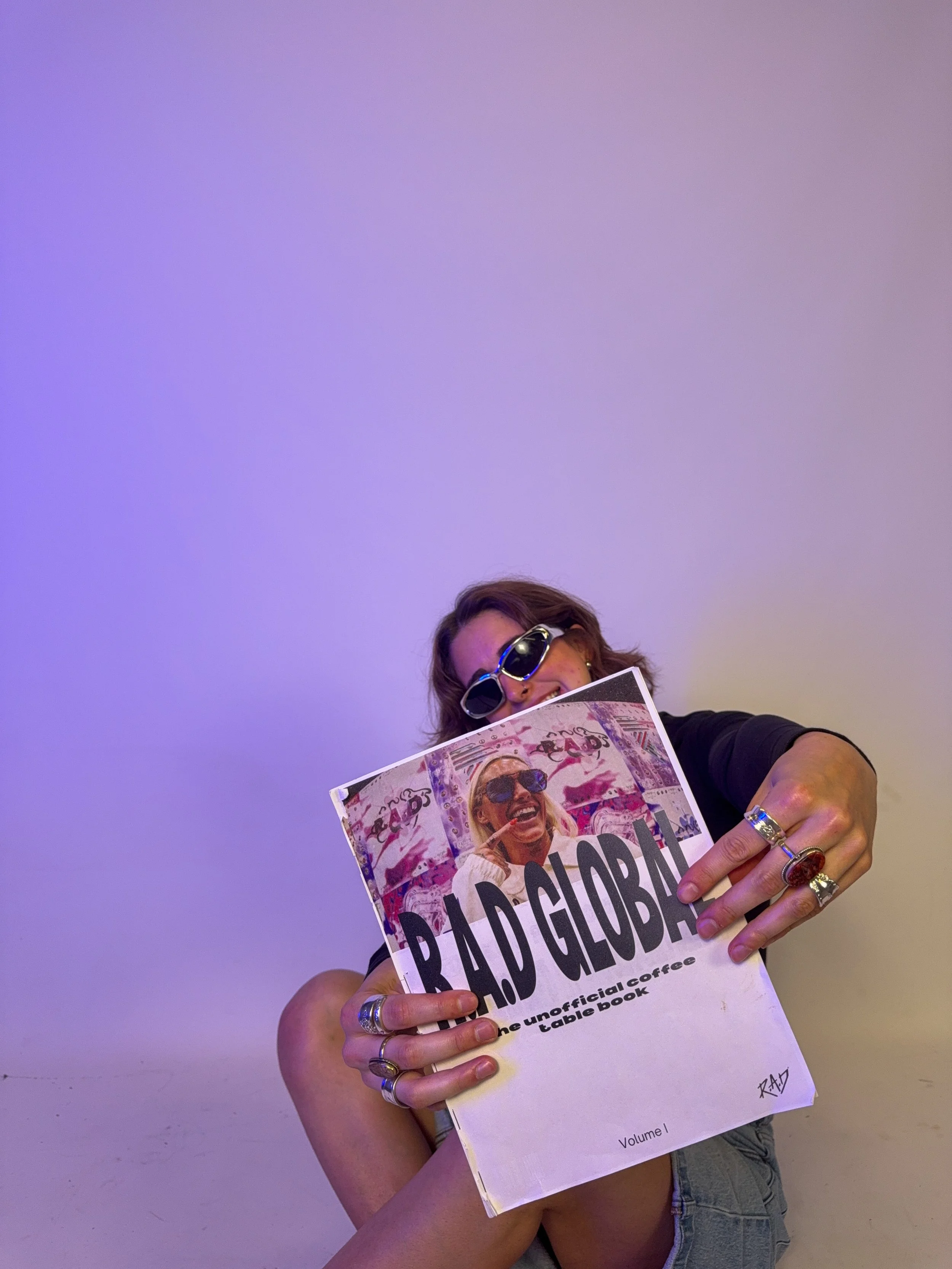
So I turned R.A.D Global’s story
into a coffee table book.


Insight:
R.A.D Global’s impact is meaningful, but its depth and emotion aren’t
fully captured through digital channels alone.
Idea:
Translate R.A.D Global’s work into a physical, editorial experience that
invites deeper engagement and makes the impact feel tangible.
LET’S REWIND

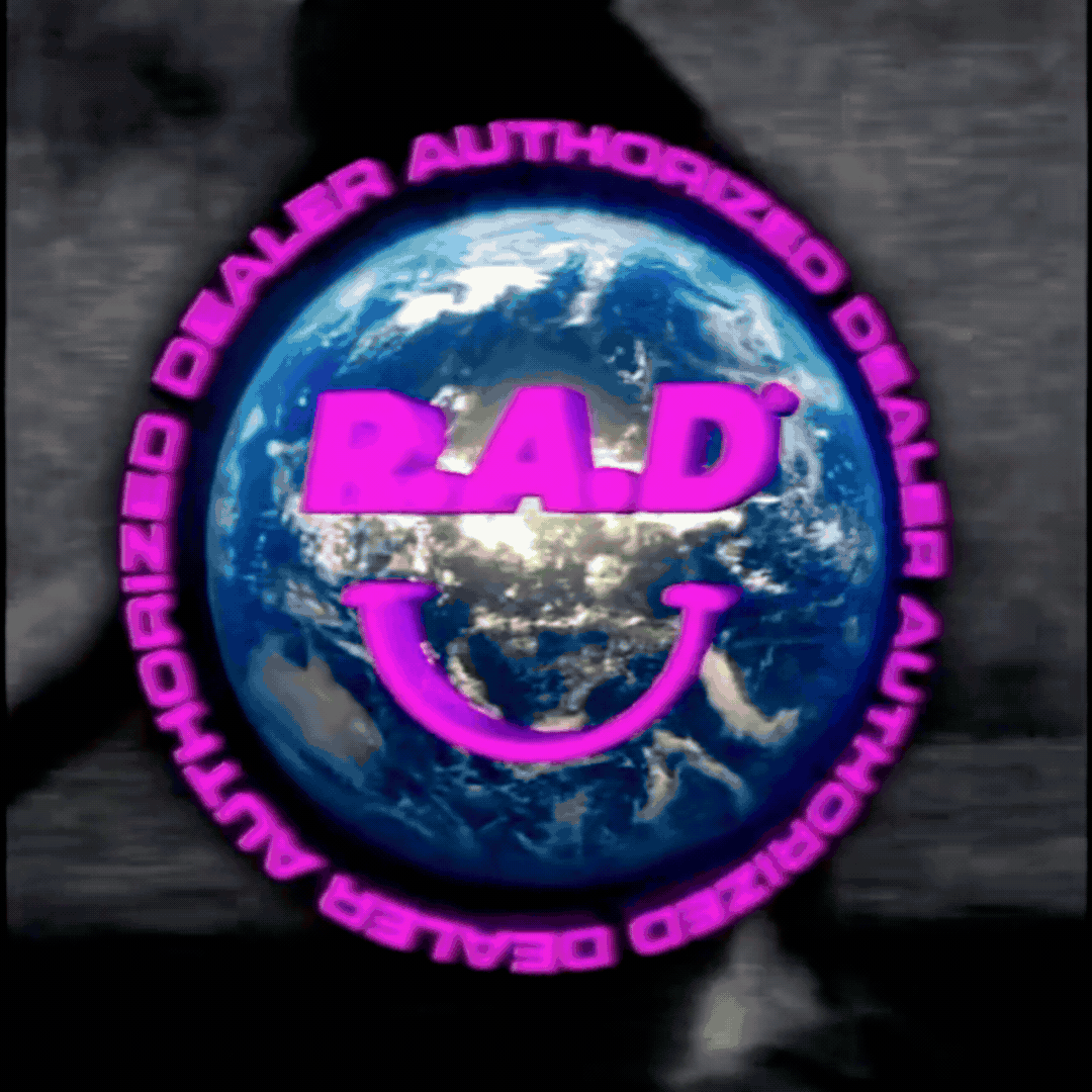
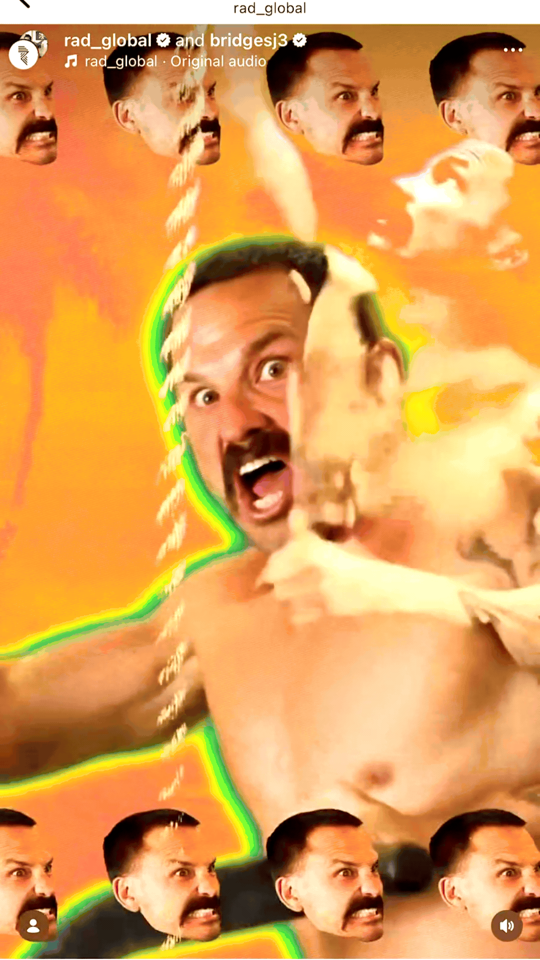
R.A.D® is a Portland-based
training brand blending
performance, streetwear,
and 90s subculture.

The brand’s niche focus
limits its growth and profitability
compared to larger,
more widely recognized competitors.

People see training gear as
an extension of their identity
and want pieces that create a sense of
belonging and fit into their lives
beyond the gym.

Expand beyond performance
into lifestyle,
showing up in culture,
not just sport.

MY ROLES
-
I developed the strategy by conducting one-on-one interviews and a competitive industry analysis to better understand the distance running community. I used these insights to identify key tensions and shape a concept that felt authentic to the audience while differentiating from competitors.
-
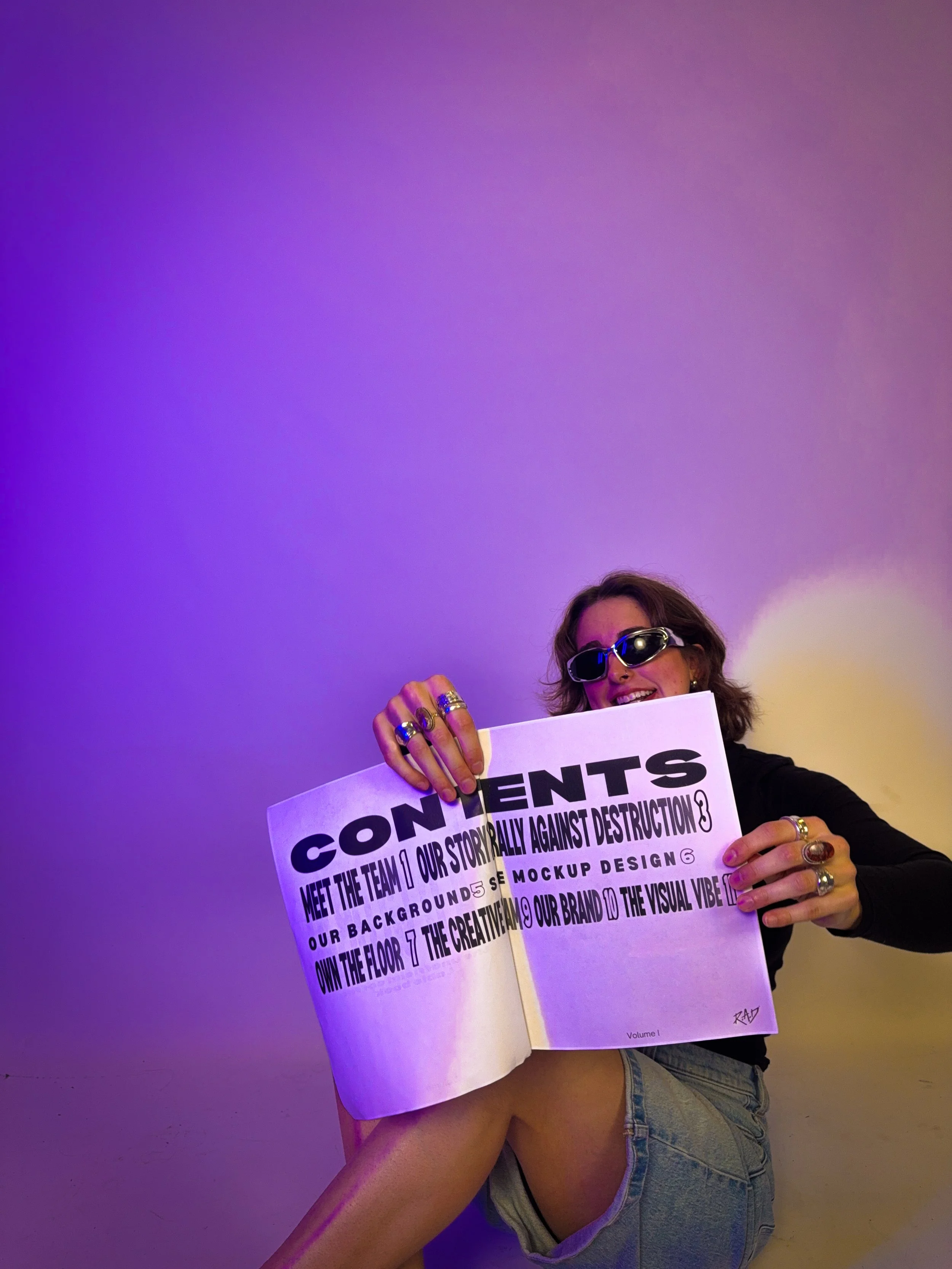
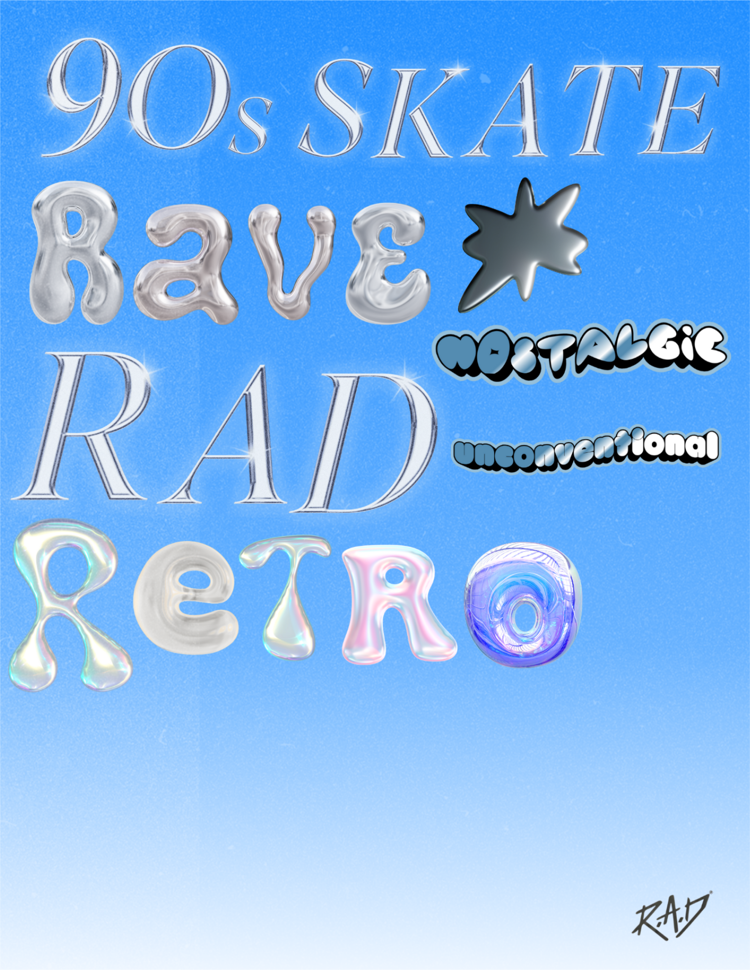
I developed the art direction by translating RAD Global’s niche subculture into a tactile, editorial coffee table book. I used intentional typography, raw image treatment, and immersive layouts to create a visual system that felt authentic to insiders while intriguing to outsiders.
TEAM:
SIENA
LUCY
